Good eCommerce design is not only about making a website look modern. It is about making the store easier to search, easier to trust, and easier to use. When the structure is right, customers find products faster, understand what they are buying, and move through checkout with less hesitation. That matters even more for businesses with large catalogues, technical products, or sales across multiple channels. Google also uses the mobile version of a site for indexing, and recommends strong page experience and Core Web Vitals, so design quality affects visibility as well as usability.
Design starts with product discovery, not decoration
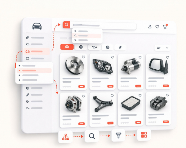
A common mistake in eCommerce is to focus on banners, colors, and animations before fixing navigation, category logic, and filters. In practice, customers do not visit a store to admire the layout. They visit to find the right product with as little friction as possible. That is especially true in stores with large inventories, spare parts, or used items, where accuracy matters more than visual effects.
A strong eCommerce layout helps users move from broad category to exact product without confusion. Clear menu structure, logical categories, useful filters, and consistent naming reduce wasted time. The same principle matters for search engines too. Google’s eCommerce guidance emphasizes making online stores discoverable through clean technical foundations and clear product information, while accurate product data helps Google match items to relevant queries.
---
Mobile-first design is no longer optional
Many stores are still reviewed mainly on desktop, while real visitors often browse on mobile first. That creates a gap between what a business thinks looks good and what buyers actually experience. On a phone, weak spacing, oversized popups, confusing filters, and slow-loading images turn a store into a frustrating experience very quickly.
This is not just a UX issue. Google states that it uses the mobile version of a site for indexing and ranking. Google also recommends achieving good Core Web Vitals because they measure real-world loading performance, interactivity, and visual stability. In other words, mobile usability and site performance are not side details. They are part of the foundation of a store that wants long-term organic growth.
Product pages should answer questions before a buyer asks them
A product page should reduce uncertainty. That means the buyer should quickly understand what the product is, whether it is available, what condition it is in, and whether it matches their need. For technical catalogues, that may also include model references, part numbers, compatibility details, or condition notes. For used goods, clear wording and honest presentation matter even more.
Google’s product structured data documentation shows why this level of clarity matters. When product pages include the right markup, Google can show richer information in search, including price, availability, ratings, shipping details, and more. Google’s product snippet documentation says product markup can make pages eligible for results that include price, rating, review information, and availability. That means better product pages do not only help visitors on-site; they can improve how listings appear before the click as well.
Strong images do more than make the page look cleaner
In eCommerce, product imagery is part of the sales process. Weak, inconsistent, or low-quality photos can create doubt even when the product itself is good. This becomes especially important in categories where condition matters, such as used parts, machinery, tools, or refurbished goods.
Google Merchant Center documentation notes that image quality matters and considers images above 1024 pixels to be high resolution. Google also provides separate image SEO guidance because image discovery and presentation influence how pages are found and understood in search. For a store, that means product images should not be treated as an afterthought. Clean, accurate, well-prepared images support both conversion and search visibility.
Checkout design has a direct effect on lost revenue
A beautiful store still underperforms if checkout creates friction. Complicated forms, unclear totals, forced registration, or too many steps can stop a buyer who was ready to purchase. That is one of the reasons why checkout simplification usually delivers faster business impact than cosmetic homepage changes.
Baymard’s checkout research reports an average cart abandonment rate of 70.19%, and its statistics page notes that 18% of shoppers have abandoned an order because the checkout process was too long or too complicated. That does not mean every abandoned cart is avoidable, but it clearly shows how expensive poor checkout UX can be. In practical terms, better eCommerce design means fewer unnecessary fields, clearer action buttons, stronger summary blocks, and a flow that feels obvious from cart to confirmation.
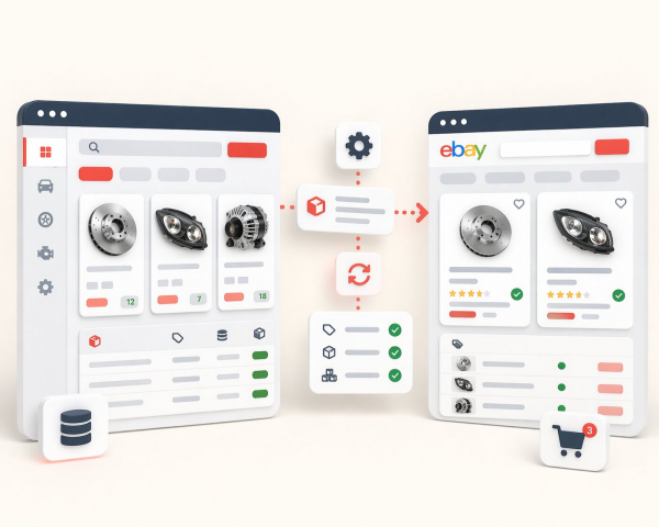
Catalogue structure matters even more when you sell on multiple channels
For growing businesses, web design should not be separated from product data structure. A store that sells through its own website, eBay, and other marketplaces needs consistency behind the visual layer. Product names, attributes, availability, brand fields, conditions, and category mapping all affect how efficiently the business operates.
This is also supported by marketplace logic. eBay states that item specifics are descriptive keywords and explains that they play an important role in increasing listing visibility on both eBay and external search engines. eBay also notes that the more data sellers provide, the better it can match an item to what buyers are looking for through search, filters, and category pages. That is why good eCommerce design is not only about front-end styling. It should be built on a structured catalogue that can support search, filtering, marketplace sync, and future automation.
A store that is easier to manage is usually easier to scale
Businesses often feel the pain of poor design only after the catalogue grows. At the beginning, a small store can survive with inconsistent naming, weak filters, and manual fixes. Later, that becomes expensive. Teams lose time editing product data, buyers struggle to compare items, and marketplace feeds become harder to maintain.
A better approach is to treat design, data structure, and operations as one system. The website should not only look trustworthy; it should support real daily work. That includes clean category logic, reusable content patterns, structured product data, image consistency, and pages that are easy to expand without rebuilding everything later. Google’s eCommerce and structured data documentation both point in the same direction: clarity and structure make products easier to understand, easier to index, and easier to present in search.
Final thought
The best eCommerce websites do not win because they are flashy. They win because they remove doubt. They help people find the right product, understand it quickly, trust the business, and complete the purchase without friction. For businesses with large catalogues or multi-channel sales, good design also needs to support structured data, scalable catalogue management, and marketplace-ready product information.
That is why web design for eCommerce should be approached as a business tool, not just a visual exercise. When design, product data, and usability work together, the result is not only a better-looking store. It is a store that is easier to grow.